

Substack Profile Page – I Stuffed Up Mine (But You Don’t Have To)

When I first started on Substack, I wasn’t thinking about my bio, cover image, or profile photo.
All I cared about was getting that first post out—and honestly, that felt scary enough.
So I kept going. A second post. A third. It was more like journaling than publishing, and at the time, I didn’t think the details of my profile really mattered.
The wake-up call came when Veronica, whose Lemon Tree Cohort I was part of, mentioned me in one of her posts and linked to my profile and publication. My initial excitement turned into a crushing awareness of how I had let myself down because there was nothing there to welcome anyone new.
No bio
A cover image that didn’t make sense
A profile photo where my face was barely visible (full-body shot)
Basically, my profile said nothing about who I was or why someone might want to stick around.
And here’s the part that really stings — I’m a creative designer. Yet I treated my Substack profile like a throwaway placeholder instead of what it really is one of the most important touchpoints for new readers.
That was the moment I knew I had to fix it. So I stepped back, studied over 100 profiles, and started noticing clear patterns and connected the dots.
Why Your Substack Profile Matters
Your profile is working 24/7. Every time someone stumbles across you through a note, a recommendation, a mentions, share, or a search, your profile is the very first stop.
And in just a few seconds, readers are quietly asking themselves: Is this a space for me?
If your profile doesn’t help them make that choice, they’ll likely drift away.
What Actually Happens When Someone Visits Your Profile
First impressions happen fast and as a designer, I know it’s all about visual hierarchy. Your eye follows a predictable path when you land on any page, and Substack profiles are no different.
Here’s exactly how people scan your profile, in this order:
Cover image – biggest thing on the page, sets the mood
Profile photo – we’re naturally drawn to faces
Name + newsletter title
Bio – your 250-character pitch
Links – Ways to find you elsewhere
Recent posts – proof you’re active and you write
Each piece either feels clear and inviting or adds friction that nudges people to leave. Good design happens when all these elements work together with clear visual consistency to tell one cohesive story.
Quick Wins
After looking through more than 100 profiles, it became clear if you get these three right — your cover image, your profile photo, and your bio, you’re already ahead.
Let’s look at some quick wins for each.
1. Cover Image
Your cover image is the first thing people see. Think of it as your profile’s “hello.” It sets the vibe. If it feels random
Specs: 1200 × 400px | 3:1 Ratio | PNG, JPG, GIF
Example 1: Margaret William
She uses her logo as the cover image, a common choice for many. But in her case, the text in the logo isn’t very legible. On mobile, it’s pretty much not legible, so new readers don’t get clarity at first glance.

Example 2: Michael Lim
His cover is big, bold text that clearly states what he does and what’s in it for his audience. It’s simple, high-contrast, and easy to read on both desktop and mobile. Michael’s reduces cognitive load and sets expectations immediately

A logo cover image delivers a subtle brand touch, while big, bold text communicates directly what the reader can expect. With big bold text make sure to
Keep it simple with high contrast
Reads well on mobile
Match the tone of your writing and vibe of your branding
2. Profile Photo
Tiny but powerful. People want to know who’s behind the words. At 256px, detail gets lost fast. A busy background or a full-body or half torso shot just turns into noise.
Go for a clean, close headshot
Good lighting + a background that doesn’t compete
Face should fill 60–80% of the frame
Specs: 256 × 256px | Square Image | 1:1 Ratio | PNG, JPG, GIF
Your profile photo is tiny on Substack—especially on mobile. If your face isn’t visible, readers can’t connect.
Best case – close-up, head-and-shoulders
Your face is clearly visible, even on mobile. Readers can see your expression, which feels personal and easy to connect with. From a designer/UX perspective, the strongest profile photos usually fall in the head-and-shoulders range, with your face filling about 60–80% of the circle once cropped.
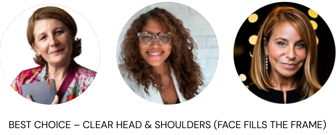
Magdalena Ponurska | Kyra Faison-Gardner | Andrea Maizes
Okay but not great – torso shots.
They look fine on desktop, but on mobile device face is harder to make out.
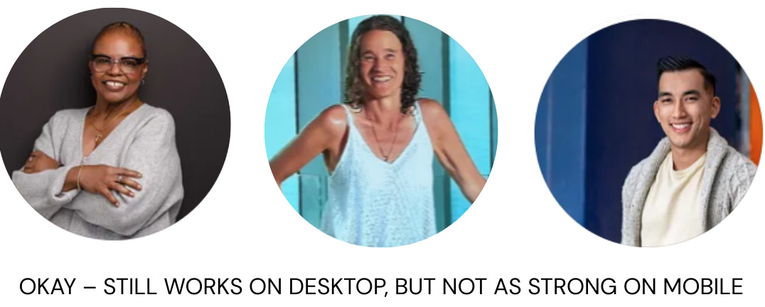
Margaret Williams | Lis | Michael Lim
What to avoid – full body or distant shots.
Beautiful in another context, but in a tiny circle your face disappears and when people can’t see who’s behind the words, connection stalls before it begins.
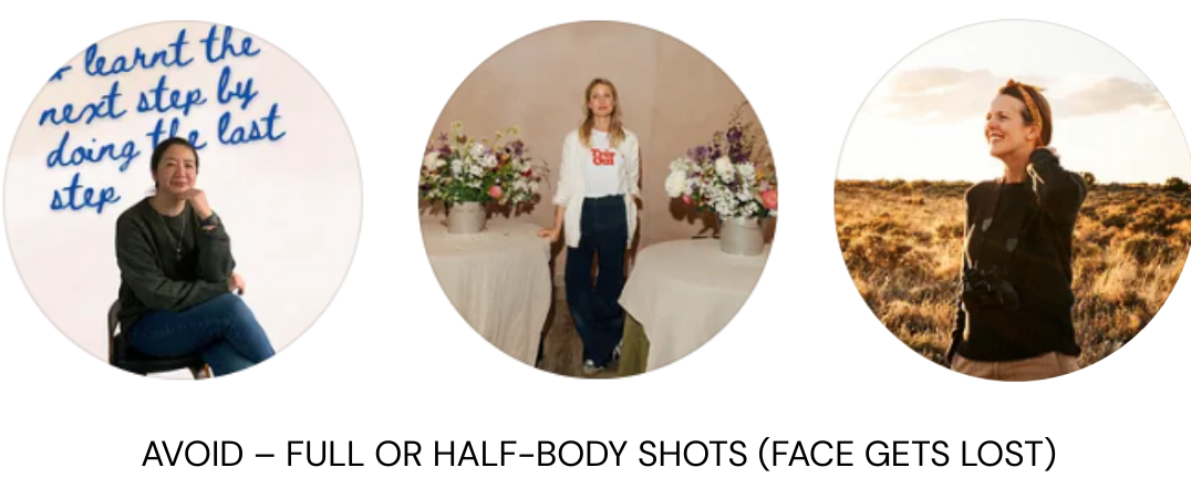
Tripty Rasaily | Willow Crossley | Laura Fenton
👉 Think eye contact that connects.
3. Bio
This is where most people trip. Too vague, too clever, or talking only about the newsletter.
The best bios I saw did 5 things well:
Led with who they are (instant trust)
Called out who they help (relevance)
Made the value obvious (why subscribe)
Had a bit of personality or revealed something about them (so it doesn’t feel generic)
Included a link to a call-to-action (freebie, resource, or about page)
The Big Formula that works better in my opinion:
[Your expertise] | [What you do] | [Something personal] | Who it is for] [get this result] | [Free offer/link]
When I first started, I had no bio at all.
Now, it looks like this:
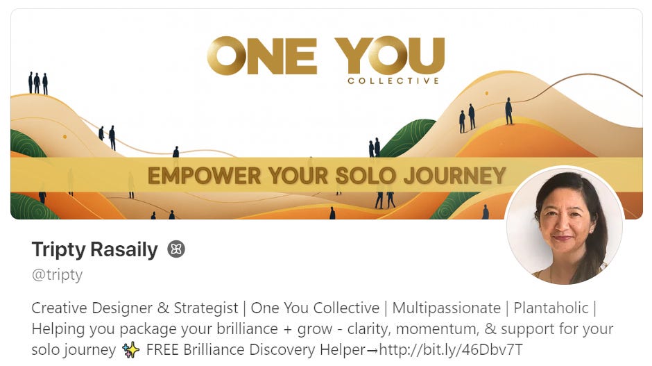
Creative Designer & Strategist | One You Collective | Multipassionate | Recovering Plantaholic | Helping you package your brilliance + grow - clarity, momentum, & support for your solo journey ✨ FREE Brilliance Discovery→http://bit.ly/46Dbv7T
It tells people who I am, who I help, and what they’ll get if they subscribe while still sounding like me. I know it will evolve over time but it is a good starting point.
The Real Cost of “I’ll Fix It Later”
Your profile is like the front of a shop.
With a clear sign and open windows → people feel welcome to step inside.
With no sign and covered glass → they’ll keep walking, not knowing what they’re missing.
Every day you wait is another potential reader who might have connected deeply with your writing but never realized it was meant for them.
What You Can Do Today
You don’t need to overhaul everything at once. Small, intentional changes go a long way in helping new readers feel like they’ve landed in the right place.
Here are three simple steps you can take right now:
Write a bio that feels like you.
Use the formula as a guide, but keep your voice natural. Let readers know who you are, who you write for, and what they’ll gain by following along.Add a cover image that sets the mood.
Think of it as a first impression—it should hint at your vibe and what your writing is about, without overwhelming the page.Choose a photo where readers can actually see you.
A clear, friendly headshot builds instant trust. Faces always help us connect more than logos or distant shots.
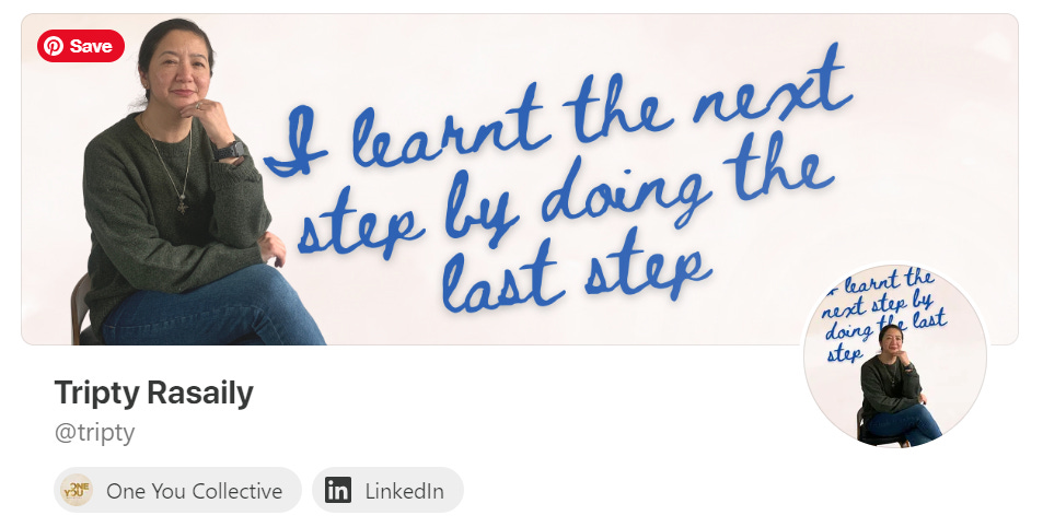
And here’s my updated version. It’s still simple, but now it gives new readers a better sense of who I am and what my publication is about.
Want step-by-step examples, image sizes, and ready-made templates to make this easier?
Complete Substack Profile Optimization Playbook coming up Next…
Your people are out there right now, looking for exactly what you write about. Make sure they know they found the right place when they land on your profile.
What’s really holding you back from fixing your profile? This is me giving you a little push to go look at it right now.